Maximalism: More is More
I recently posted a room on Instagram from our previous home in Franklin, TN that set my instagram feed on fire. It prompted me to write this blog post about the motivation behind the design of this room. It was our great room, which as you can see was full of color and pattern.

Layers and layers give our former living room its panache.
Changing of Trends
In the last couple of months, I have been noticing an influx of interior designers using pattern and color in their designs. Gone are the days of boring neutrals; colors have arrived! I have always had a penchant for layers and layers of color and pattern. As you follow my work, you’ll notice that I don’t use many beige or solids. So, it has been a treat to see it rise in popularity.
One of the best projects I’ve seen was the spread of Danielle Rollins’ house in the December 2017 issue of Veranda. Danielle was not only fearless in her mix of patterns and color; but she also layered in the most complex furniture arrangements, utilizing many tables and ancillary small chairs. And trust me, I love a small chair. As many of my clients comment on the rooms I do for them, “Eric, you can fit more furniture in a room than anyone I know.” This is the ultimate compliment; it is a skill for sure. Recently I was doing an install, and I told my assistant, “People really don’t know how much stuff they need in a room.” It is funny, but also very true–it’s the layers of things that take a space from blah to bombshell.
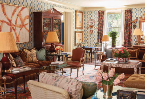
Danielle Rollins’ gorgeous Atlanta living room. Fabulous overload!
My Instagram post was really paying tribute to pattern and color and show how excited I am to see the resurgence of a style editors are calling Maximalism. Which, as I’m sure you can guess is the opposite of minimalism. I see it as a pendulum swing from Industrial/Farmhouse, which isn’t necessarily minimal, but it is very primitive, with a focus on pairing clean with distressed finishes.
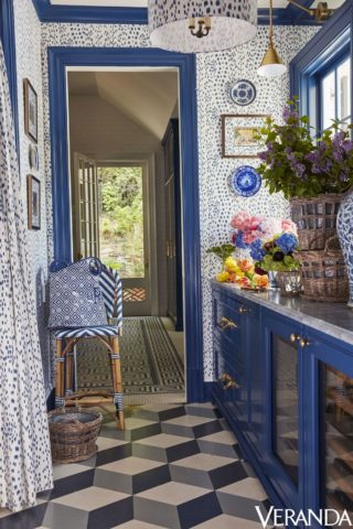
Danielle Rollins’ stunning butler’s pantry.
Exodus of Rustic Minimalism
Here is the picture again. I designed this room over seven years ago at the height of Farmhouse style. A colleague actually said to me, “Eric, I know you love traditional, but you really need to embrace Farmhouse because it’s what everybody wants.” Boy, did she not know me very well. Contrarian by nature, this made me avoid Farmhouse style even more!

Again, look at the subtle farmhouse notes in architectural trim and lighting…
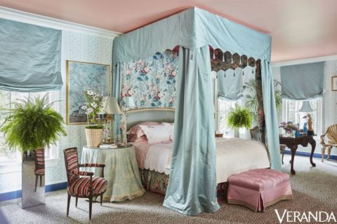
Danielle Rollins’ gorgeous master bedroom. This is perfection. She actually shows some restraint here with the solid pink ceiling.
Now, don’t misunderstand. If Farmhouse is your style, that’s ok with me. Everyone has their own taste and passion, but for a collector, such as myself, Industrial Farmhouse is too limited and the color palette too sparse. I like to create many different environments throughout my home. Some rooms are English, French, Granny (is that a style?…yes!), but the common thread I use to tie the rooms together is color.
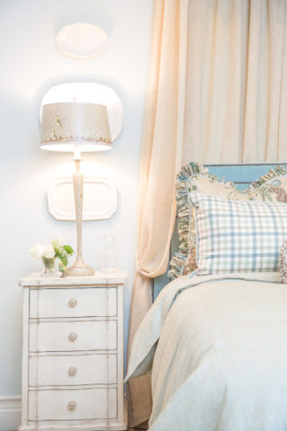
Do I see a ruffle? Perfect example of Granny Chic!
Color is Your Friend
Our great room color scheme was, in the generic sense, orange and blue. I didn’t use orange in another room in the house, but blue was used extensively, so blue was repeated throughout the room in upholstery and accessories as a unifying thread. Then, I used Blue Willow wallpaper from Lee Jofa in the attached hallway to pull the eye through to the next rooms. This created a dialogue between these spaces creating a unified whole. The overall combination looks unified and balanced.
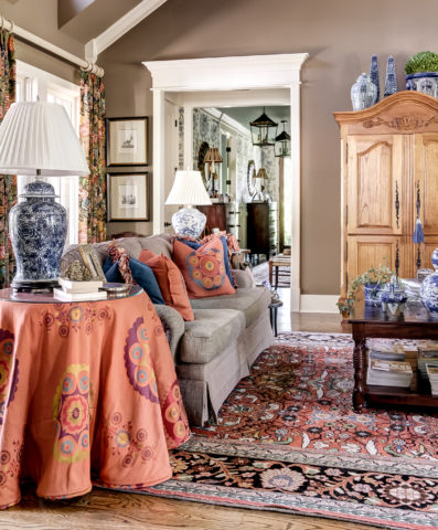
Maximalism at its finest…I kinda miss it.
All the comments and likes I received were so wonderful. The truth is, I’ve posted that picture on Instagram at least 5 times over the past 2 years and every time it’s been popular. But this time I think it broke the internet. Which leads me to think we are on the front edge of a new wave in design—Maximalism! What some design devotees have considered busy or cluttered designs in the past now has a name, Maximalism. It is the movement of the moment.