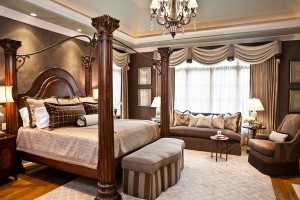
 One of my long-time Nashville interior design clients just moved into an amazing home with a master suite some would die for. However, the Venetian plaster walls with their mirror-like finish cast a plum glow with their existing gold and chocolate bedding. The room was amazing, but the client wanted the walls to look like chocolate gnoche instead of plum pudding.
Color temperature is key when selecting brown. There are red browns and blue browns. When selecting fabrics, rugs and paints, you must consider whether the brown you are working with is a cooler or warmer tone. In this room, we wanted to use the stunning plaster finish, so I selected a brown that was cooler to complement the tone of the wall. Since the clients’ existing bedding was a red brown, it exaggerated the blue tone in the wall. By selecting a warm gray and raisin chenille damask, we were able to make the brown wall look, well, brown.
Since the walls were such a focal point, I used only the large-scale damask on pillows. All the other fabrics were about soft color and texture. This allowed the subtle nature of the finish to shine like a star. I designed swag valances on bronze painted rods to mimic the iron arches of the canopy bed. The movement of the swag also kept the eye moving around the room and enhanced the architectural features of the room. To repeat the shimmer of the wall treatment I selected a metallic embossed damask pattern on the sheer. The subtle pattern and reflectivity look amazing in candlelight and fire-glow, creating a perfect couples retreat.
If you have a room where the color isn’t just quite right, consider the temperature of the colors you’ve placed together. Getting colors you select to be the same temperature is one ingredient in the recipe for a perfect room.