Wallpaper is back and it’s amazing
Some of you are still suffering from PTSD from the last wave of wallpaper in the 90’s, but I’m telling you it’s time to get back on board. Wallpaper is amazing from a couple of different perspectives:
ONE: It’s amazing because the choices are so plentiful and the designs are so large and colorful that they really add a sense of drama and lushness to a room.
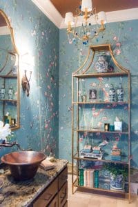
This beautiful, dramatic aviary wallpaper really takes an otherwise underwelming bathroom to a show stopping conversation piece.
TWO: It’s amazing because I can convince clients to use it more easily than in years past.
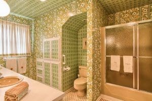
We have all had the relative who lived with an outdated eyesore wallpaper just a little (read: WAY) too long.
Being a true southerner, I have been insisting clients incorporate wallpaper into their rooms for my 20+ year career. You just can’t get the three-dimensional quality with paint that you can achieve with a wallpaper. For years, I had to practically arm wrestle clients into submission. Most of the time, if I convinced them, it was only to wallpaper their bathrooms and dining rooms. But now, we are papering anything that will stay still.
Wallpaper gives a sense of permanence to a space
In my new home in Nashville, Boxwood Hill, I would paper every room if Ruthann would let me. It makes a room feel like it’s always existed and it exudes authenticity. That is the best way I can describe it. Paint seems so temporary in comparison to paper. With wallpaper you have to select it, order it, have it installed…it’s a process and a commitment. This hunt and discover ritual makes it more special than simple paint; you get a real sense of pride and ownership that comes from the process. Also, it gives me another surface to play with. Being able to have a geometric or small scale floral to complement other patterns in the room gives much more visual interest than paint would. And, it’s this layered effect that makes my rooms appear relaxed and lived in.
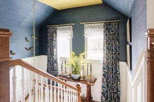
This grasscloth wallcovering I selected for this hallway feels like a textural hug when you walk through it. Paint could never give you that feel.
What should you consider when you dip your toe into the wallpaper pool?
How can you pick a pattern that you will enjoy living in for years to come? After all, today’s papers are very expensive for the most part. Gone are the days of $5 a roll and $10 a roll papers from a local stocking paper store. Today’s wallpapers are finer and more luxurious. They are printed on better ground paper for easier removal. Grasscloth wallpapers are woven and imported from some very exotic locales, which brings a sense of wanderlust to interiors. You will pay much more than in years past to add this layer to your design scheme so you must pick wisely.
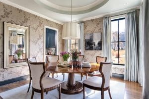
This beautiful neutral wallpaper I chose for a client really grounds the room and offers a timelessness and intimacy to a very large space.
Here are 5 rules to stick to when picking papers:
1. Go big in a small space.
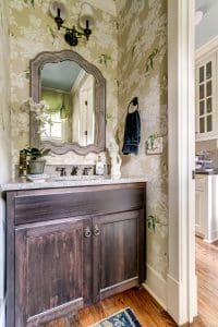
This is the powder room in my last home, and I chose a bold and beautiful flora and fauna wallpaper.
This is an age old adage, but I use it here in terms of where to use that large print you have fallen madly, deeply, in love with. No one loves a large print more than me, but if this is your first foray into wallpaper, then I would put that to-die-for, over-scale floral in a room that needs a wow. Powder Rooms are the obvious choice for this. The scale will skew the corners of the room and actually make it seem larger. Also, you won’t be in that room very often so you won’t tire of the over-scaled print quickly. (Bonus tip: Also paint the trim the same color as the major color in the paper story which will take away demarcations of the room, fooling you into thinking the room is larger than it appears.)
2. A ditty can be your friend.
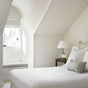
I love this wallcovering by Sister Parish. It is a classic example of a ditty.
This is showing my age here, but a “ditty” is a small toss of a pattern on a solid ground paper. It is a small scale pattern continually repeated. In large rooms, a smaller scale is best. This small scale is really making a comeback in design right now. I’m not only obsessed with it on walls, but on large upholstery as well. A smaller scale pattern becomes almost a solid used en masse and just gives an overall feeling of texture. We just used the sweetest little ditty in our new master bedroom at Boxwood Hill that I love. It feels vintage and cocooning, but is barely noticeable until you are in the room for a bit. It’s like a little discovery as you look around the room.
3. Use Grasscloth in at least one room.

This grasscloth adds a very handsome texture to this room, and accentuates the dark wooden beams.
Today’s grasscloth wallpapers are so handsome, with big, chunky grasses and bamboo veneers being used for some, as well as fine silk threads. This texture adds nice contrast to a whole house design story and keeps the rooms from feeling monotonous. One caveat, never use grasscloth in a bathroom. Powder Rooms, yes, but a full bathroom with a shower will steam and make it smell like a soaked basket! (Also, stringcloth has NOT made a comeback and is not the same as grasscloth, but that’s a different blog.)
4. If you can’t find the print you want in a paper, hang the fabric on the wall.
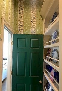
We used a Tilton Finwick fabric by Duralee as wallpaper in our dish room at Boxwood Hill.
Sometimes, I fall in love with a fabric and it doesn’t come in a matching paper. Do you think that limits me? Of course not! I simply have it pasted onto the wall. This is not the same as upholstering the wall, where you add batting and sew and staple to the wall. You can either have the fabric acrylic backed or laminated with paper. The former option is more affordable and if you have an excellent installer, you shouldn’t have any problems with this process.
5. Prints are perfect for bathrooms and dining rooms.
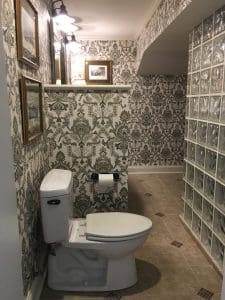
This beautiful, baroque paisley wallpaper we used in our studio bathroom really brightens up an otherwise drab room.
I love a print in every room, truly, but I particularly like them in bathroom and dining rooms. Why? Because these rooms are inherently blocky. A bathroom has a tub, cabinetry, shower stall and water closet. These are all blocks in the space that are hard to soften. Dining rooms are similar in that that are square or rectangle and the table is a rectangle and the server and or china cabinet is a rectangle. You get the idea. A printed paper can disguise and soften corners and create more softness in these spaces, giving them a more gracious feel.
Ultimately, wallpaper can cover a multitude of sins, whether it’s bad architecture or a wayward color scheme. (That’s one of my favorite ways to use wallpaper that I haven’t even talked about, to help pull together a disjointed color scheme.) But, when you get the courage to add it to your home, use these 5 rules to help refine your choices. I’m sure you have a room that could use wallpaper to add a jolt to the overall look and feel of your home.