I just love Blue
Recently, I had an Instagram follower comment on one of my interior design pictures, “I love this, even though there is no blue…” This comment really made me stop and think–do I REALLY use that much blue? Well, yes and no. Creating a colorscape is one of the first steps in designing a room. I thought it might interest my followers to know a little bit of my thought process in how I create the rooms you see on my social media channels. And, see why I use so much blue.
Choosing a Color Scheme
When I’m designing rooms, I start with prints. I look for what I call a Statement Print. This print will determine the overall color scheme of not just a room, but possibly an entire home. When I look at prints I purposefully select a cool tone (usually blues, greens, greys or purples) to add into the mix to keep an overall color scheme from becoming too visually hot (reds, corals, golds, etc). And I have to admit, I tend to gravitate towards blue.

See, I can use other colors than blue! This statement fabric inspired the entire color palette and direction of this bedroom I designed.
My basic rule of thumb on creating a color scheme is to find three main colors to use in a room. Then I can take one of those colors to pull into other rooms and use it as a lead in ancillary rooms so they have a different color scheme, but still have a linking element so there is good flow. This also creates repetition, which makes the overall design seem more balanced and cohesive.
Balancing Warm and Cool Colors
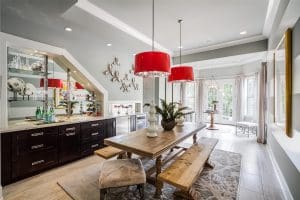
So, if I’m using a cool color to brighten up a murky color scheme, I can do the opposite to warm up a predominantly cool color scheme. I can introduce a hot color to grab the eye and focus ones attention on a point in a room. In an entertainment area I did a few years ago, I used various shades of gray and crème, but selected a pair of lipstick red barrel shade pendant lights to break up the monotony of the clean gray palette and create a much more dramatic effect. This was perfect to create a more playful and dynamic atmosphere in a space meant for casual entertaining.

The pop of cherry red really balances the soothing and cool gray on the walls in this room.
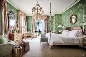
Another trick I use when selecting a color scheme, I lifted from the Prince of Chintz himself, Mario Buatta. He really is the master at creating what I call “pretty” rooms. What was his secret? He looks for the most obscure color in a print and puts that color on the walls and accents. It really creates a more complex mood in the room than selecting the primary or secondary colors in a print. Try it the next time you are considering colors for your room. It really works.

Classic and vivd: a typical Mario Buatta room.
The Blue Bedroom
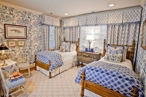
Blue is used a lot in my designs because it is a livable cool tone; sometimes I even joke it is a neutral. Purple can be very polarizing, and mint or pale greens can seem more “retirement home” for lack of a better phrase. People of all ages love blue and find it easy to live with, which is why I gravitate for it and incorporate it in to many of my designs. But, as much as I love blue, I do not use it as the main color in my main living rooms, because I like to save it for bedrooms. Cool bedrooms are more restful to me. So, I use blue on ceilings and passementerie throughout the main house to create that linking element, but I save the real splash of blue for bedrooms.

Try incorporating blue into your homes if you want a pop of color or trying to update a color palette. It will really change the mood and bring a sense of freshness to an otherwise tired room.