It’s honesty time and I need to purge the negativity from my soul. After flipping through this month’s latest design magazines, I closed my eyes and told Ruthann to just let me die. I will be refusing all food and drink, so please, don’t try to revive me.
The signs of life in the interior design world are equally non-responsive. A blip here, a heart beat there. Somebody bring in the paddles. Or not. Just let us all pass to the Great Designer in the Gilded Beyond.
From where I lie, there are two major problems in the world today. No, I’m not talking about the Syrian crisis or the tanking economy. Lord knows I can barely handle mismatched patterns. No, I’m talking about the global state of design when Sanford & Sons-inspired decor is showing up in our high design print magazines. I’m also talking about a two-page spread on a house in the Hamptons featuring a white room with one small desk and one chair, nothing else.
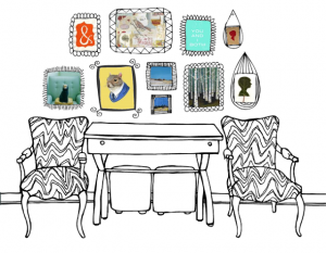
First, bringing in an old coffee table from the rain does not a shabby chic room make. To put it another way, throwing your collection of crap on a wall and calling it a collage also does not a salon make. Yes, the curated wall has elements that are accessible to the every man, woman or child. However, not everyone has the talent to edit it. Hanging a Picasso and a Monet side by side and lauding it as disparate objects that create a narrative tension is offensive to me and Monet.
Second, are we seriously calling empty rooms luxury design? Milieu, a design magazine out of Houston, quoted an Atlanta Decorative Arts Center Hall of Famer Marie Warren, “A big part of my job is to listen and understand what they are yearning for — and then bring it to life. I understand fairly quickly if a potential client and I are going to be able to work together.” She also said that designers don’t truly understand the craft of using scale and proportion in their work, which is why they resort to sparce spaces and call it minimalism. God bless Texas and Sister Marie Warren! If I ended up with an empty white on white room, I’d say hire another interior designer and hashtag it #expensivelessonlearned.
A trained eye for design comes from understanding the principals of beauty: repetition, symmetry, proportion, composition, positive and negative space. Speaking of negative space, I’m now officially out of mine knowing that champions of luxury design the likes of Marie Warren are still out there, working and honing her craft for the delight of creating a space her clients will cherish.
This rant has been brought to you compliments of moi and a little thing I like to call #redemptivedesign.
-Eric


