Part Four: Pastels are cool again
Thanks for following along on my take on the trends I am most excited about over the past year. Wicker, chintz and damask are some of my tried and true go-tos for designing rooms that clients love. These items all add elegance and whimsy to my designs. But what is the last trend to make my list of favorites? The return of Pastel colors!
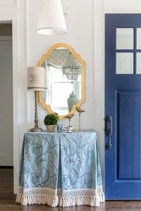
Skirted Console in Lavender and Pale Blue Sets the Tone of the whole house
Color choices can be the rise or fall of a room scheme. So, I am constantly asked from eager trend followers what the newest, freshest colors are for them to incorporate into their own rooms. Of course, if you’ve followed my designs for long, you know how I feel about trends. I am not a slave to trends. However, one trend that I am excited has made a comeback is the use of pastels. Pink is one trend that I never tire of. Or mint, or peach. But, how to make these pale colors look fresh, since it’s a refresh on an old trend, I thought I would give you a few simple tips.
Fresh pastel tip 1: Ground the light with the dark.
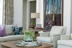
Living Room with Lavender pillows and Mint Upholstery contrasted by dark Navy and Chocolate
When I am designing new rooms for clients, I start with a print. Lately, as I mentioned, I am pulling out lilac or mint, but am grounding these colors with dark counterparts, such as navy and chocolate. The dark contrast creates a dynamic play between the light and dark. It also gives it a masculine edge so that the pastel is more livable for men and for women.
Fresh pastel tip 2: Painterly pallets are created with gradations of colors.
If you don’t like the contrast of pairing the light pastel with dark grounds, then here’s another idea. Begin with a floral print. Pull out the green color of the stem of the flower, or the taupe, woody stem, and use that color as a contrast welt on cushions or as the accent color on a pillow. Then, pair a varying shade of the pastel, a little lighting or deeper, and use that for the wall color. This gradation of color is like a painter uses when he composes a painting. Think of a rose in a painting. It’s not just one shade of pink, it is varying shades of pink, cerise and red, to give it more depth and realness. Using this same principle, you can create a moodier pallet in your room by partnering other gradations of the pastel as accents in a room. This can be achieved with lamps and other accessories as well.
Fresh pastel tip 3: Crisp white is always right.
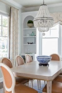 Is there anything more chic than a simple white dress shirt? I love the look of bright white with pretty pastels. Since clean lines and simple forms are paramount to many room designs today, don’t confuse the senses with too many colors. By washing a room in all one color, you can create a calm, serene, yet pretty environment by using white as a simple background. Consider using leather as a textural counterpoint in this scenario to create richness without being loud with a contrasting color. The effect of a room such as this is you will notice the people more than the decorations.
Incorporating pastels can be tricky. You don’t want a room to look like Blanche’s living room in South Florida, so if you want to try using pastels in your next project, try some of my quick tips to give you guidelines that will help you create a timeless room using one of the biggest trends that will be surging in 2019.