Creating a beautiful master bedroom en suite without a total renovation.

I get asked by a lot of my clients what’s my favorite room to decorate. I guess it’s a client’s way of prioritizing the order of her design projects. Many clients can’t decide where to start in their new home, so they ask me where I’d like to start. Well I can unequivocally state that my favorite room to decorate is a Master Bedroom and Bathroom suite. And, in every house my wife and I have lived in, it’s the first room I decorate
I cannot sleep in a space that isn’t conducive to sleep. The way my mind works, fortunately or unfortunately, depending on how one looks at it, I have to have everything in its place and lovely to look at. That’s just how I’m wired. When I lay my head down on a plush pillow covered in a cotton sateen sheet (my personal preference), I can only drift of to sweet dreamland if my draperies are neatly pulled and the duvet is in a French style fold at the foot of the bed…blessing or curse, you decide.
So, when I visited a new client who had an entire home to  decorate, they asked me the same question: “So, Eric, where should we start?” I gave them my standard answer that I would start in the Master, but clients rarely do. I can tell you in over 17 years of decorating homes, the client typically starts in the public rooms—the ones visitors see. But to my delight, she said I agree, that’s where my husband wants to start. Kismet!
Why do I love Master Bedrooms? Well, I personally love beautiful things. And, in an era in design where the popular fad is “eclectic” or “vintage” or “industrial,” that’s a hard sell to clients. However, I find that clients are more open to pretty fabrics and finishes in a bedroom, where the whole experience is focused on rest and relaxation. Men become more flexible on painted finishes and floral fabrics in a zone meant for romance and sleep. Women are more willing to give into their soft side without fear of repercussions from a macho husband.
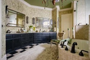
For this client I went full throttle into a garden theme. How did I choose my theme? Well, the client’s house sits on a golf course with the most beautiful view of the greens. In fact the strong grass green color was my inspiration. The sticking point was their dismal bathroom. Ugh! Almost all projects have a few “sows ears” that need to be turned into silk purses. This bathroom! It had black and tan checkerboard floors, black cabinets and mirrors everywhere. Oh, and a shower you could drive your car through…my personal pet peeve, but that’s another article. The homeowner asked if we could just “gut” it, but I said, let’s see what some simple decorating can do.
I started my search for finishes with the wallcovering. I love wallcovering. I call it the great unifier. I have seen many interior spaces with contradicting finishes and styles made whole by the perfectly selected wallcovering. I knew I wanted the garden theme, so I went to looking for the perfect floral. The trick with selecting paper is to pick up colors that are used in the existing finishes. This helps pull all the elements together, creating a more unified discourse among finishes.
For this bathroom, I wanted the paper to have beige and grass green with a touch of black. As I scanned through my extensive library of wallcoverings, I stumbled across a garden themed collection that had this exact color combination. It was a floral, which I thought would be perfect to help soften all the hard edges in the bath. This leads me to another reason I love wallcovering in a bathroom. It adds an incredible amount of softness to an otherwise hard space. Think about it. Bathrooms are inherently blocky. You have a vanity cabinet…block. You have a tub, shower…block, block. You get the idea. To help counter-act this, I look for patterns that have a fluid movement to contrast the harshness of all the block shapes.
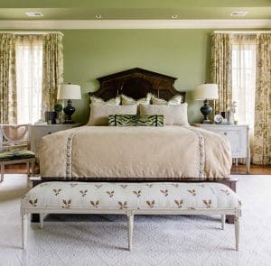
Once I had selected the perfect paper, grass green was the perfect choice for the walls allowing me to pull other fabrics that played into the garden theme. I chose to use the fabric that matched the wallpaper as the lead print for the master bedroom. By using the matching fabric, I created the feeling of continuity between the two spaces, which reinforces the en suite or spa hotel experience, which is what I am always trying to do with bedrooms.
Another reason I selected a print for all of the windows was to create a more intimate feeling for the room. The bedroom was incredibly large and I find that it is difficult for people to feel comfortable in vast spaces. In order to combat this, patterns create more visual interest and look larger than solids. This choice was very effective for this bedroom and creates a more intimate feeling. One more trick for bedrooms, add traversing sheers (sheers you can open and close) behind the main window treatment. What does this do? Not only does it give you a layer of privacy without blocking out all the daylight when privacy is desired, but is creates the most beautifully filtered light. Again, creating that sense of romance… perfect for a bedroom!
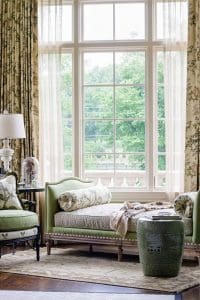
When it came to laying out the furniture, that was pretty straight-forward; the bed, night stands, dresser, bench at the foot of the bed… you know the drill. But remember that view to the golf green? The room had a sitting area that has 3 walls of windows overlooking the green. So, I imagined this space as a conservatory of sorts. When you are in that space, with the plethora of floral drapes surrounding you, it’s as if you are in a rose garden overlooking the most beautiful green. I placed a daybed (or some people call it a backless sofa) and a small French style bergere chair all upholstered in coordinating fabrics with the floral. I placed a marble top iron bistro table as an end table to continue a relaxed mood, as if you could take a light breakfast from room service. Tres chic!
I asked my client what their favorite part of the new room was. “The fact that we didn’t have to renovate the bathroom is astounding. We can’t believe you were able to make the bathroom beautiful with just some wallpaper, new lights and accessories. They also love how the bedroom feels smaller and more intimate. Luckily for me, the wife AND husband both love flowers and gardening, so it played into their already traditional sensibilities and hobbies.

By allowing me to show the possibilities of working with what the clients had instead of replacing all of it, we were able to create something beautiful and use the money saved from a full bathroom renovation to decorate other spaces in their new home. That’s a win and the thing that sweet dreams are made of.